Make Forms Fun with TypeForm
While working on the Internet every day, we come across many websites that require us to fill some forms. Be it to register for a website’s newsletters, to apply for a service, to give feedback for a product or simply to create an account, we often come face to face with online form filling. However, forms in their essence are not very interesting. Creating fields for a form or filling vertically stacked requirements for details are supremely boring tasks. Both the creators and the audience of an online form generally find dealing with forms quite mundane.
However, form filling cannot be skipped just because it is boring. Where it is needed, it is needed. So how does one ensure that people don’t fill forms just because they need to, but because they want to? Can a form be made such that people actually get attracted towards it? With TypeForm, yes it can!
TypeForm
“Forms Done Awesomely”, that’s the tagline of TypeForm and this unique and interesting online tool proves its tagline true. There’s so much packed inside it that you will not grow tired of experimenting with it. TypeForm claims to improve your form completion rate drastically by making the questions in the form appear like a conversation. It offers to transform the way your business collects data by matching the form to your unique style and charm. Plus, this tool makes sure your forms look as good on a smartphone or tablet as they do on a PC.
By creating forms with TypeForm, you can push your marketing in your forms. Make your business logo the background of the form, match the colors to your business’s colors and use the slang and lingo you use in your business proposals. In short, you can add as many aspects to your forms and make them as unique and as appealing as you want using this amazing tool. With TypeForm, prepare to make a great first impression!
Its Eye-Catchy!
When you open up the link for TypeForm.com, you expect to find a regular website describing the tool and its capabilities. Instead, what you find completely blows you away. A background that’s brought to life with moving images (or more correctly, short videos) adorns the homepage and this is the most attractive feature of the website. It brings the creativity of HTML5 to a whole new level. The tagline of the website is displayed right in the center of the page and is very in-your-face! Once you calm yourself enough to proceed, you can scroll down to have a look at the complete homepage through an arrow displayed at the bottom center.
On the upper right corner of the page is an option to Log in to the website (for existing users). Alongside this option is a symbol depicting more options (three stacked horizontal lines). Clicking on it displays the usual list of options including Tour, Examples, Pricing etc. Cute little animated slippers adjacent to the “Join TypeForm” link at the bottom make for a delightful sight!
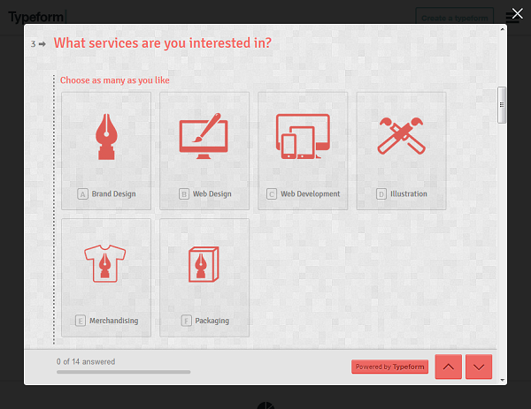
The creativity behind the TypeForm team in visible in their examples too. The example page is divided into sections based on type of forms. Each section has a short paragraph dedicated to it and of course, some example forms. Click on an example and you will be shown a beautiful interactive form that you can fill as a user. This will help you in getting many ideas as to how you want to design your form. You can also gather an impression as a user and understand your forms from their prospective, which will help in creating a better form.

How it Works
The homepage offers 3 main choices to users – Create a Form, View Examples or Log in. Since we’ve talked about Examples and Log in is obvious, lets jump straight to “Create a Form”.
To create a form you’ll have to Log in or register first! After logging in you’ll be taken to your Account panel where you can see an option to create a new TypeForm. This panel is where you’ll also see all the forms you’ve created when you log in later. Hover on “Create a new typeform” and you’ll see 2 choices – “Start from Scratch” and “Use a Template”. Choose the one you wish by clicking on it and the page lights will suddenly dim and you’ll be shown the pricing options and language selection. The Core plan is for free or you can buy the Pro plan for a nominal amount for cool features like Stripe integration, file upload, hidden fields etc. After you’ve done what’s needed, you’re all set!

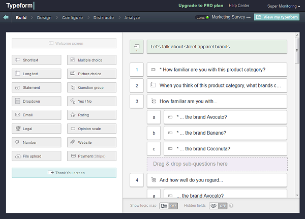
What you see next will be your playground! Add-on options to the left and the form layout to the right. Simply drag and drop whatever you want to see in your form from the left to the right. Multiple options for every field you add provide you freedom for creativity like never before. You’ll want to do everything in every form!
From rating symbols to MCQs, from drop-downs to thank you screens, TypeForm has it all.
Pros vs. Cons
The good side is obvious here. Having better looking and feeling forms will help your business collect more data, from a larger audience, in lesser time. Be it as a feedback, poll or survey, you’ll derive more out of your online forms than before. It’s cost-effective too!
Create awesome online forms with @Typeform typeform.com/ via @supermonitoring
The very minor cons, or more correctly glitches were with some aspects of the website design. For instance, the random change of colors and background though very cool and animated, could prove a bit taxing on the eyes after a while. Also, getting your hang around the website and various aspects of the tool usage (which are many) could take a little time and effort.
Wrapping it up
All in all, if you’ve grown tired of creating the same old online forms and want to give them a fresh burst of energy at no or minimal cost, you should definitely try TypeForm. Want to make your forms and the related information gathering interested and eye-catching? TypeForm.com is the tool for you. Go explore!


